Raitis Ritenieks Boksa Klubs
Raitis came with a single requirement: the identity had to carry his personal story. Not just boxing club — his boxing club. The challenge was finding a visual language that could hold two things at once: the raw physicality of the sport and the quiet weight of a man who reads poetry and once kept a bear as a companion.
A logo that only said tough would miss the point entirely.


Two R's, two gloves
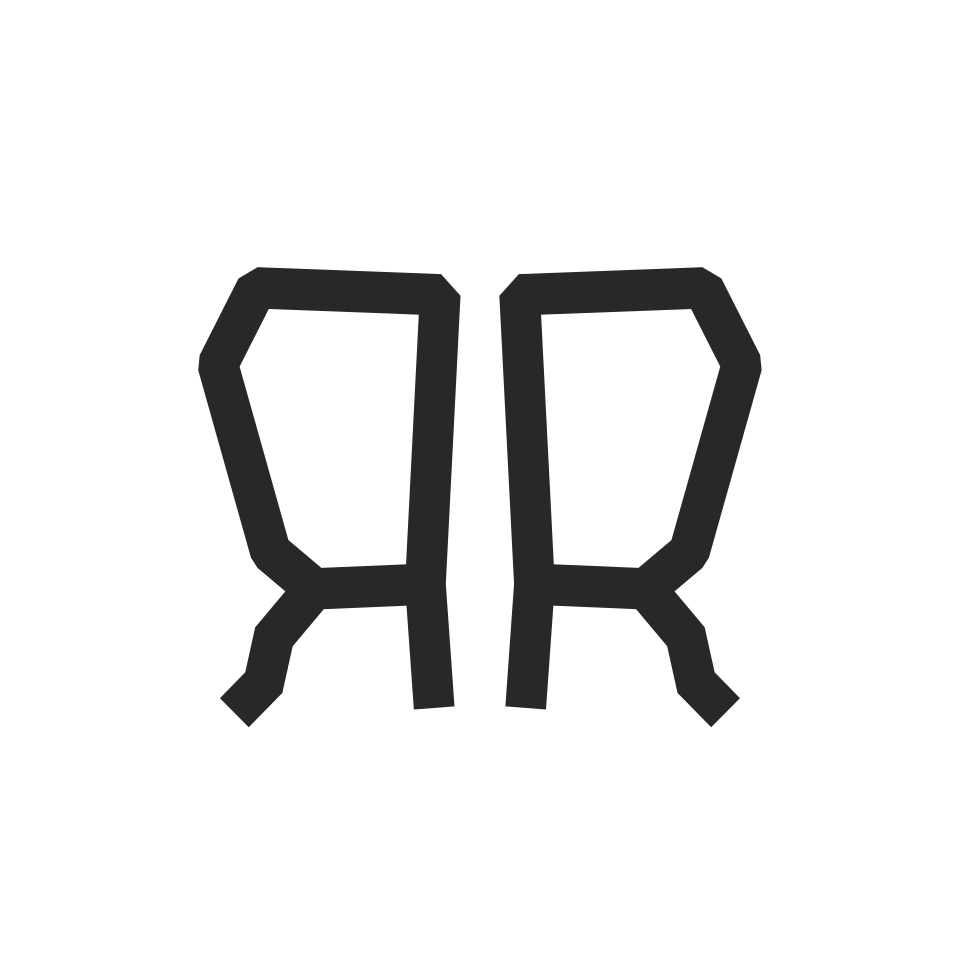
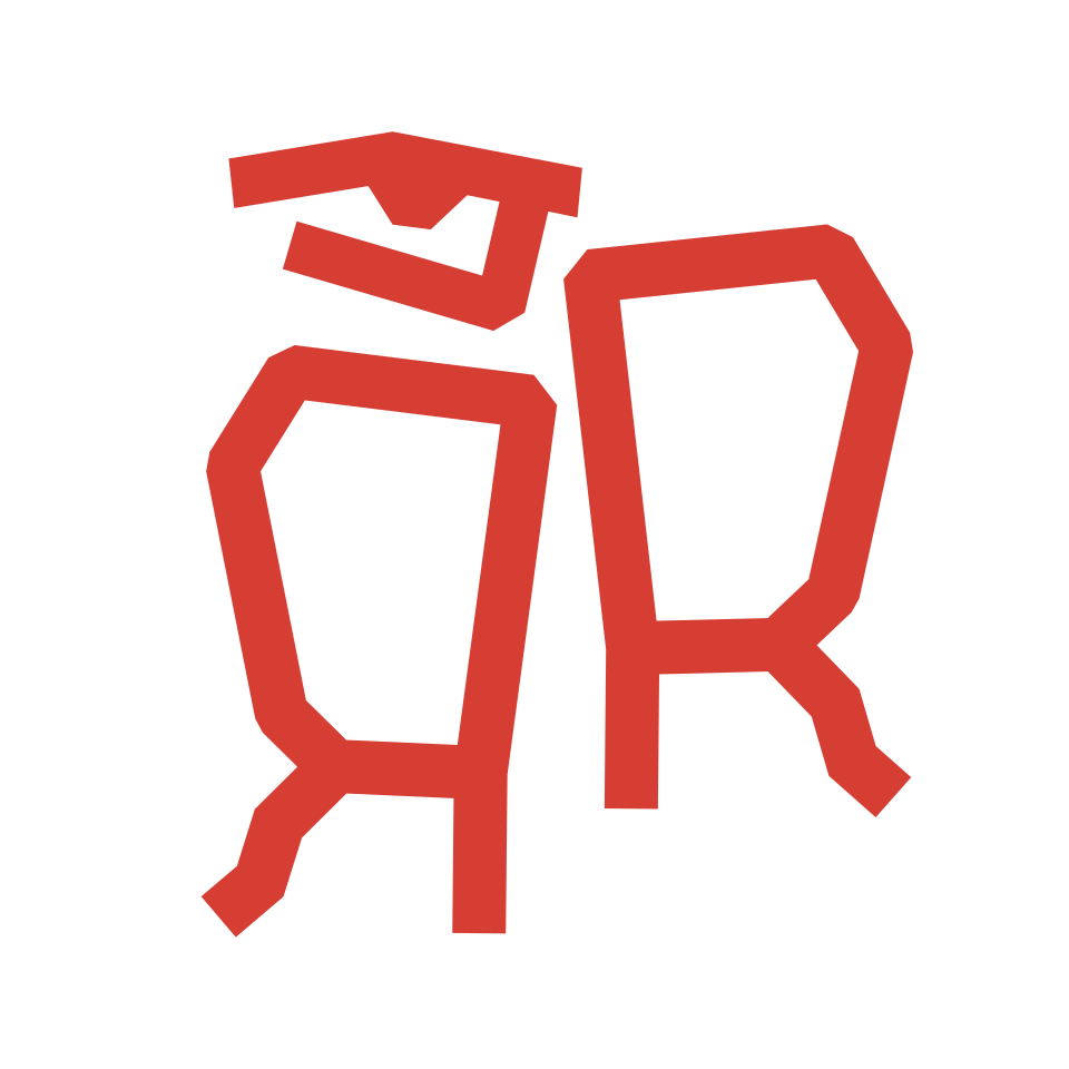
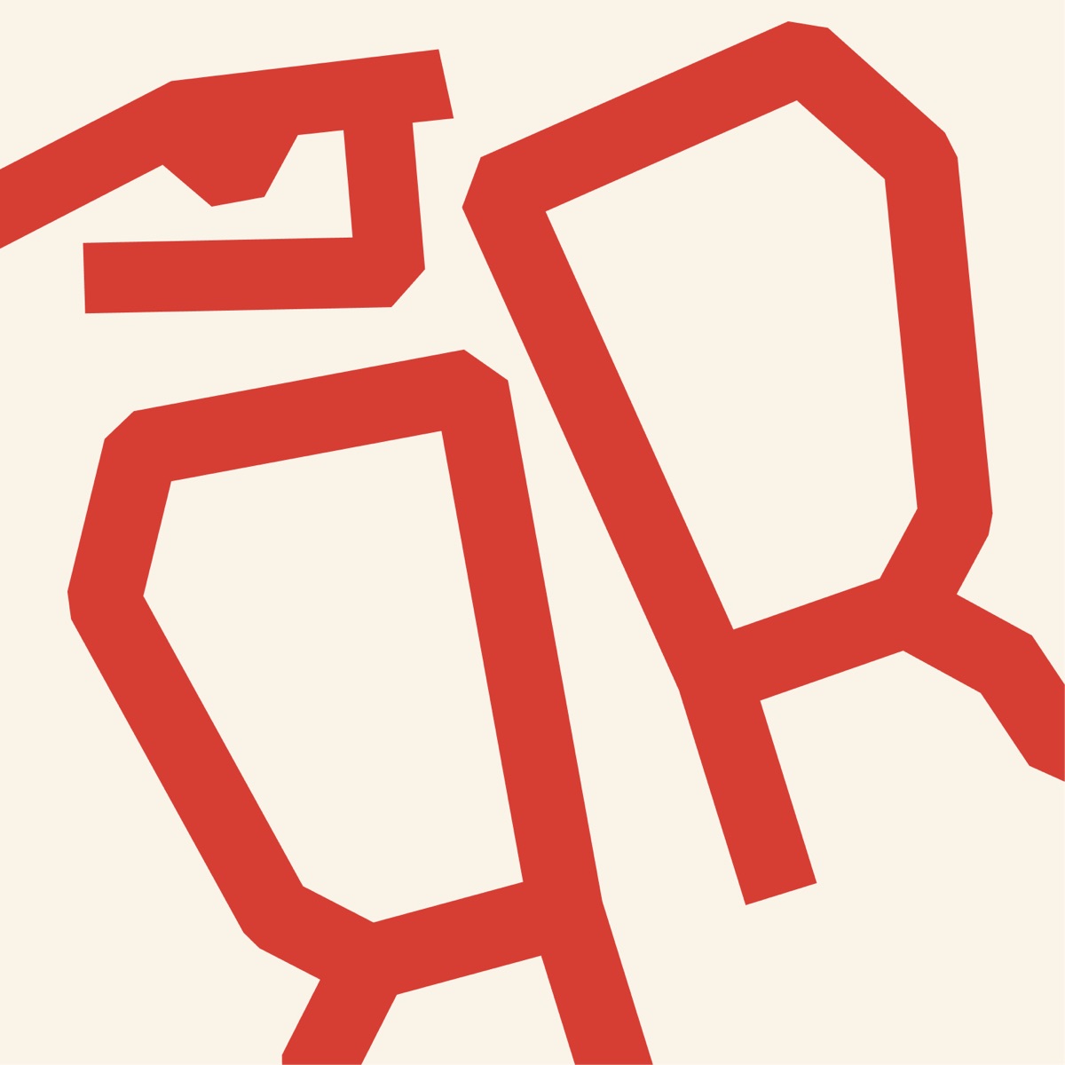
The answer came from the initials. By taking the two R's of Raitis Ritenieks and reshaping their letterforms into the silhouette of boxing gloves, the mark carries both meanings in a single gesture. The typographic approach draws from the tradition of illuminated letters — the ornate, deliberate capitals found at the openings of manuscripts and epic poems — anchoring the identity in the world of language and story as much as sport. Two R's. Two gloves. One system that does not choose between the fighter and the poet.
Bargais & Raitis
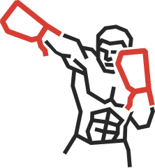
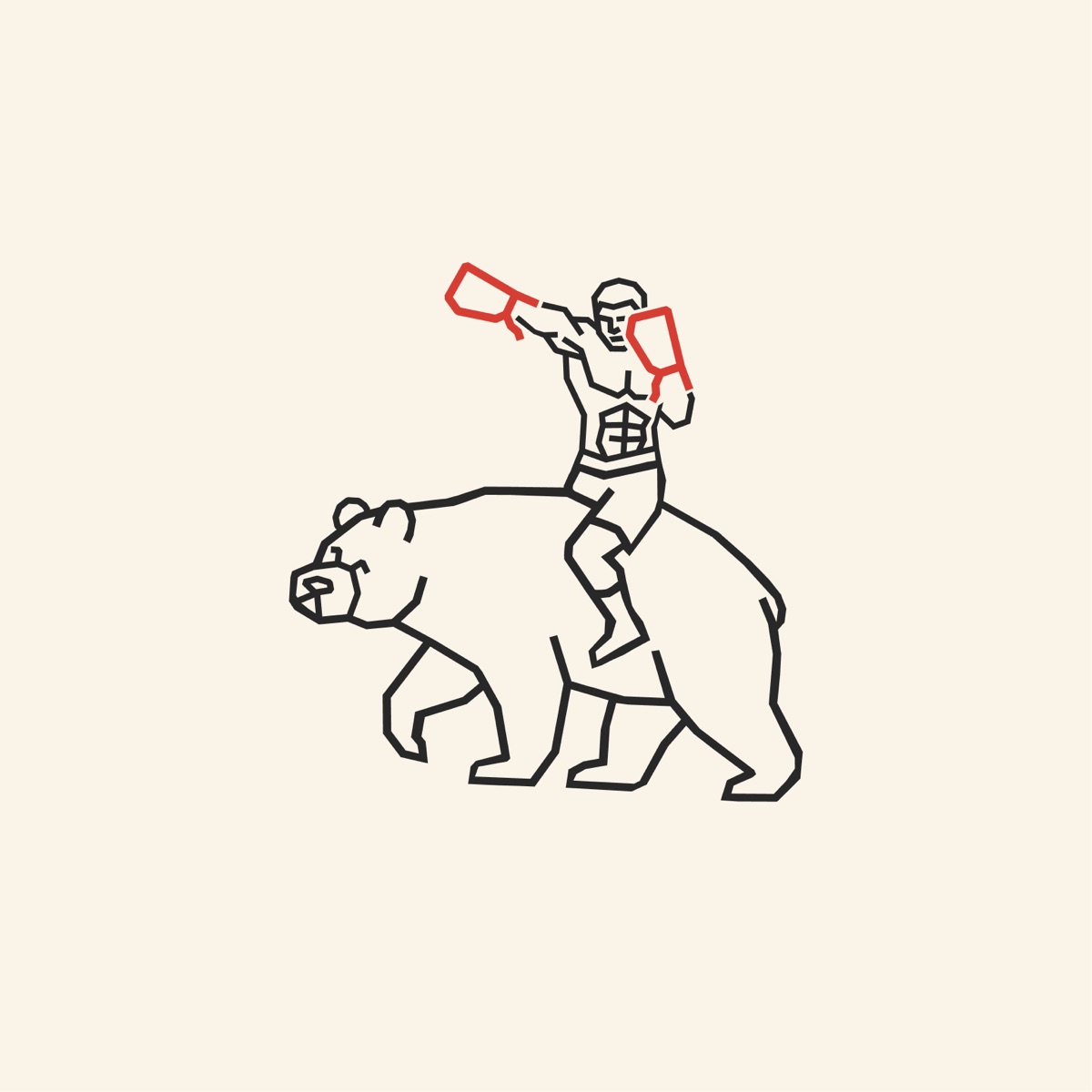
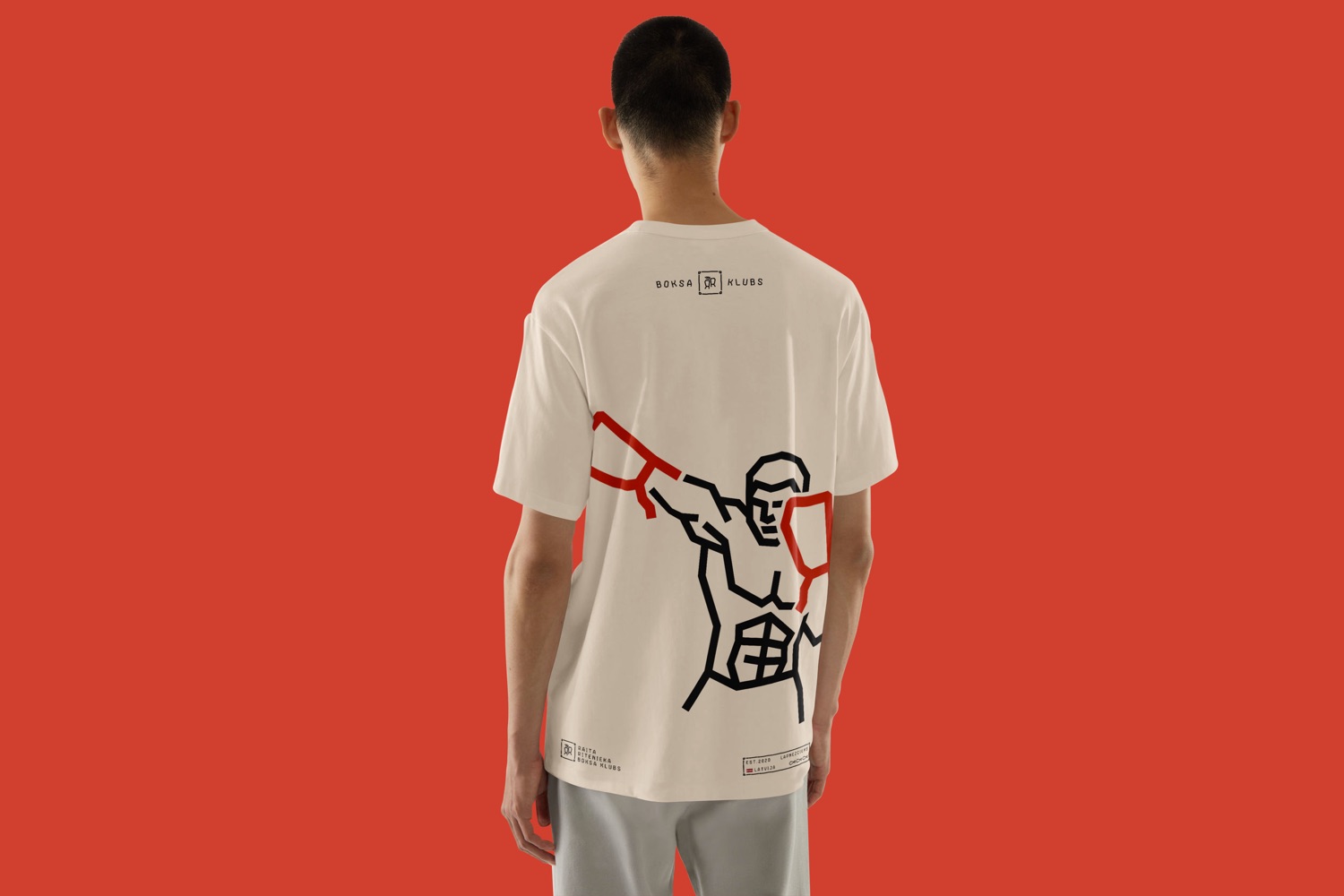
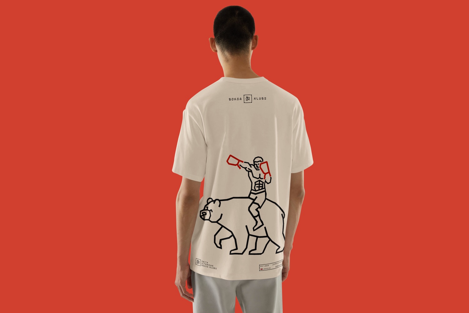
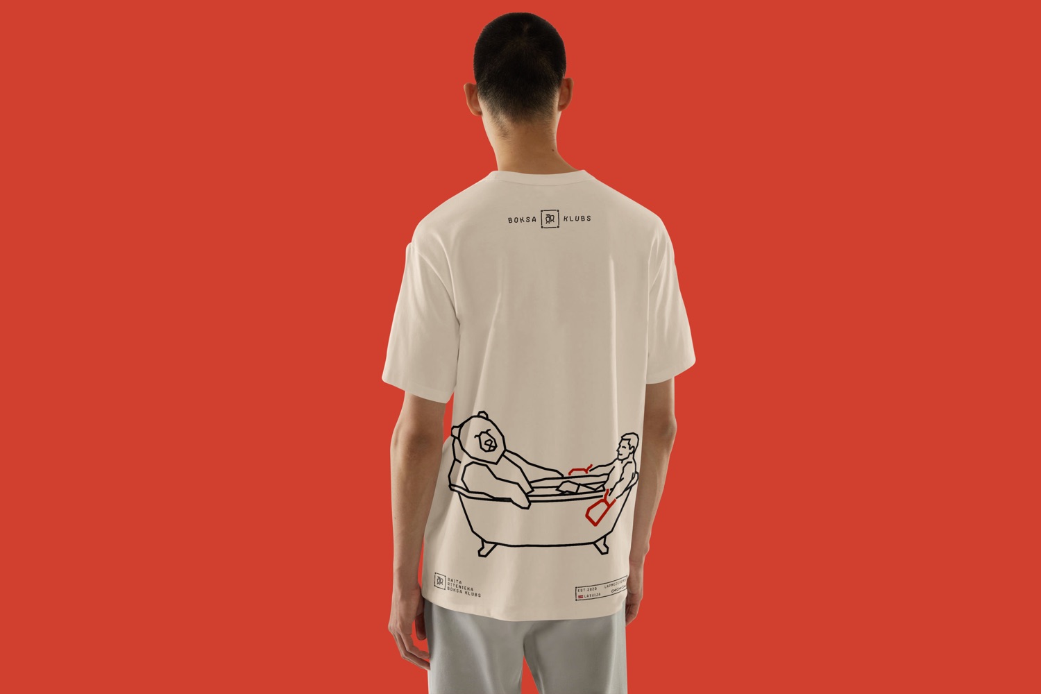
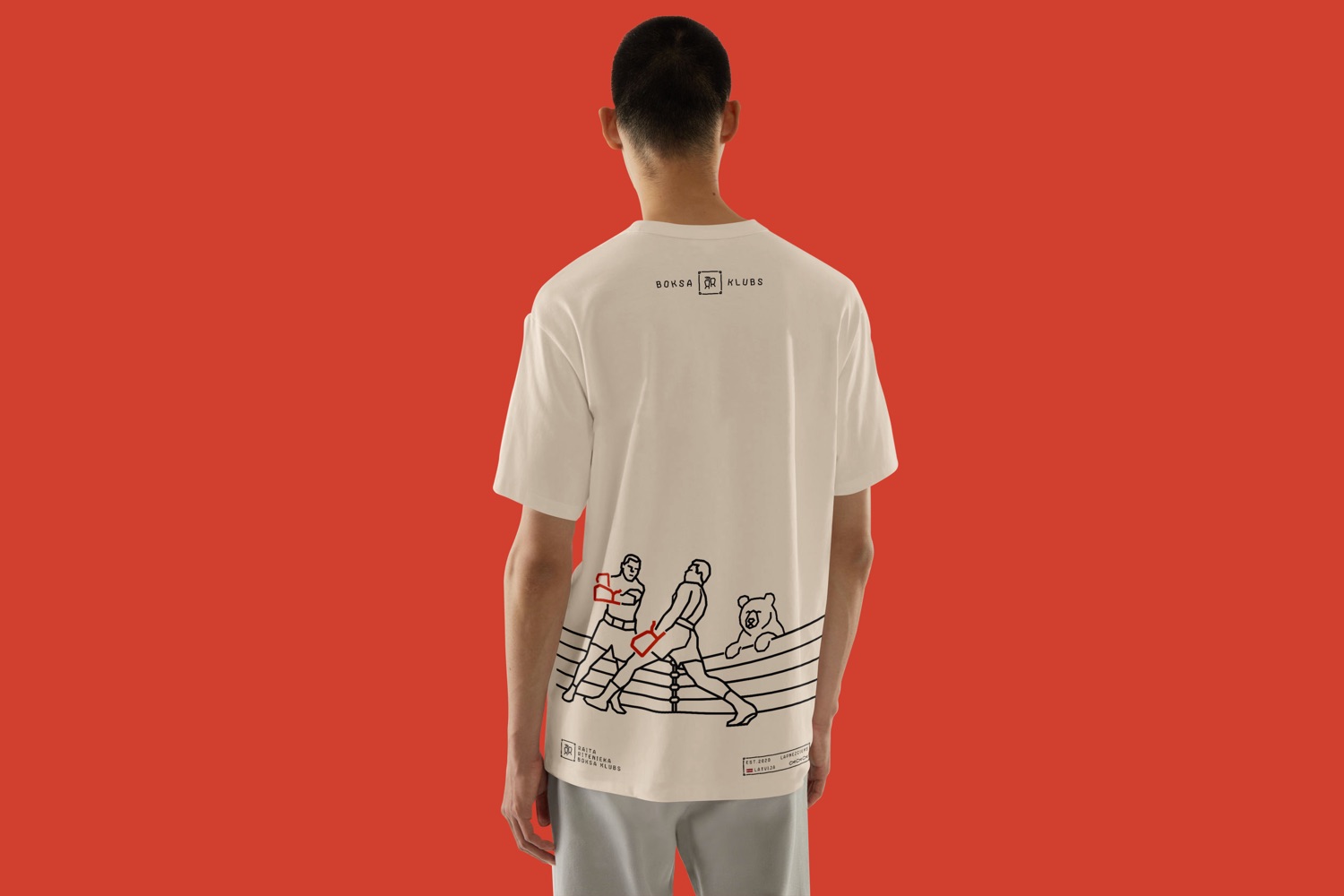
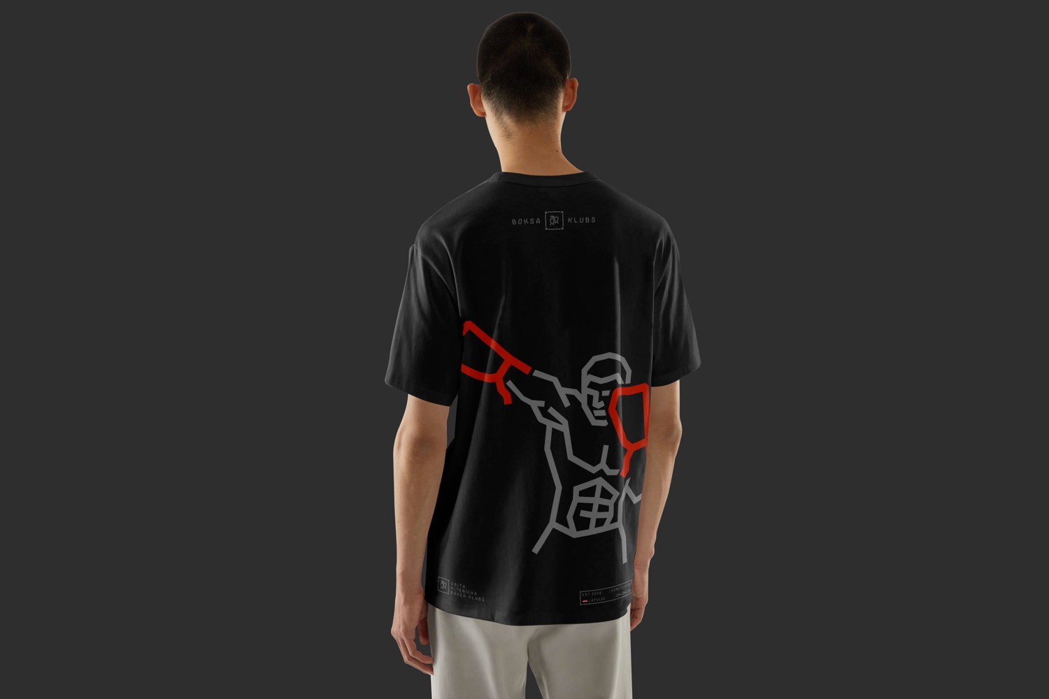
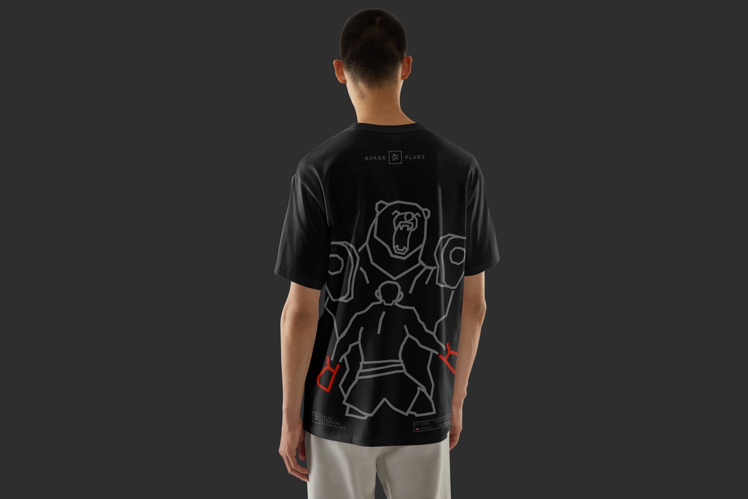
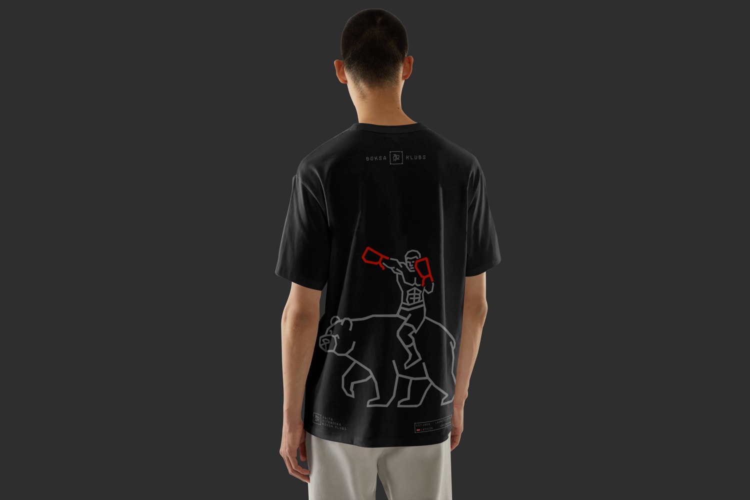
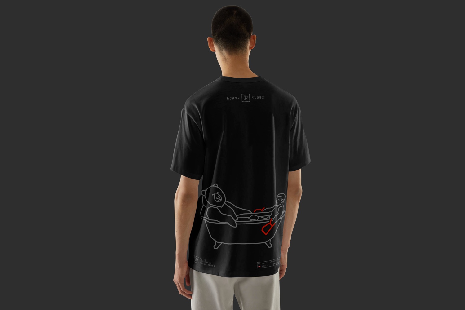
A set of original illustrations documents the mythology of the man and the bear — training sessions, quiet evenings, corner support during a bout. Bargais is not a mascot; he is a character, drawn from life, in a style that echoes both vintage boxing posters and hand-drawn book illustration.
Named After the Bear
▌
Bargais Display is a custom typeface, drawn from scratch and developed outward from the logo letterforms. Named after the bear who started it all, it carries the same structural logic as the mark — bold, considered, built for impact.
LĻMNŅOPRSŠTUŪVZ
0 1 2 3 4 5 6 7 8 9 . , : ; ? – / [ ]
The World Around It
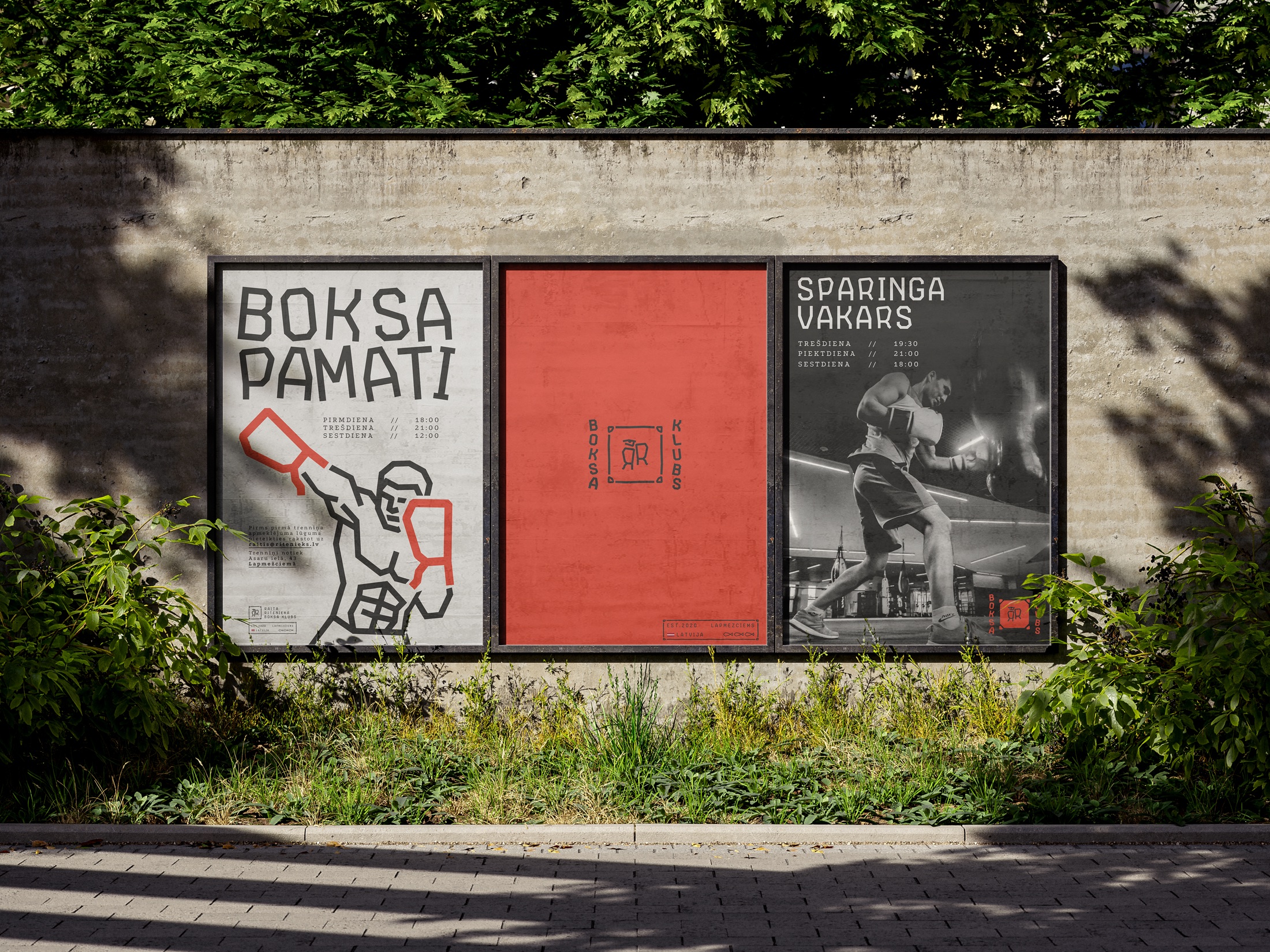
Identity, apparel, posters and the ring itself — the system seen in the wild, where the fighter and the poet live side by side.
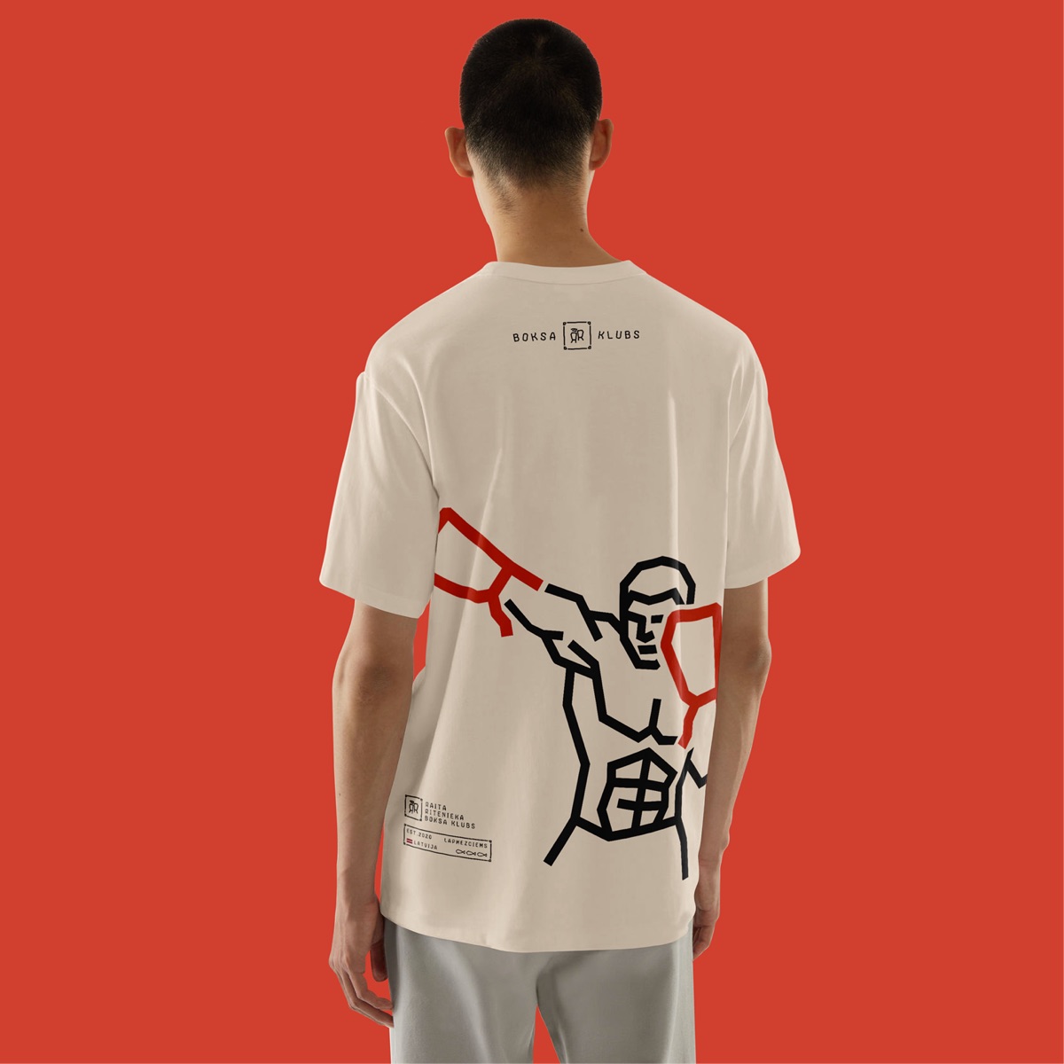
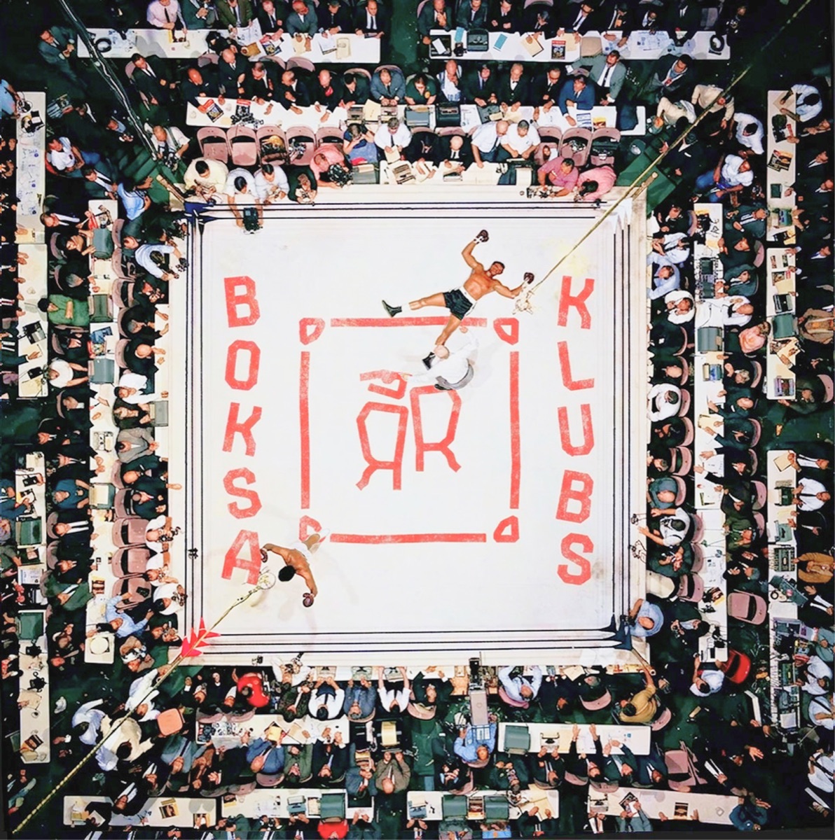
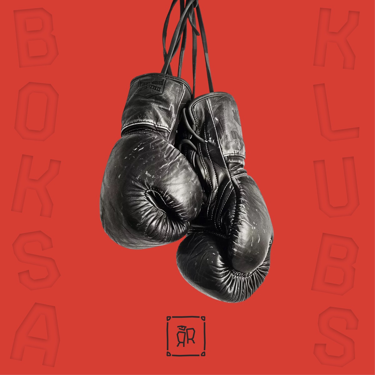
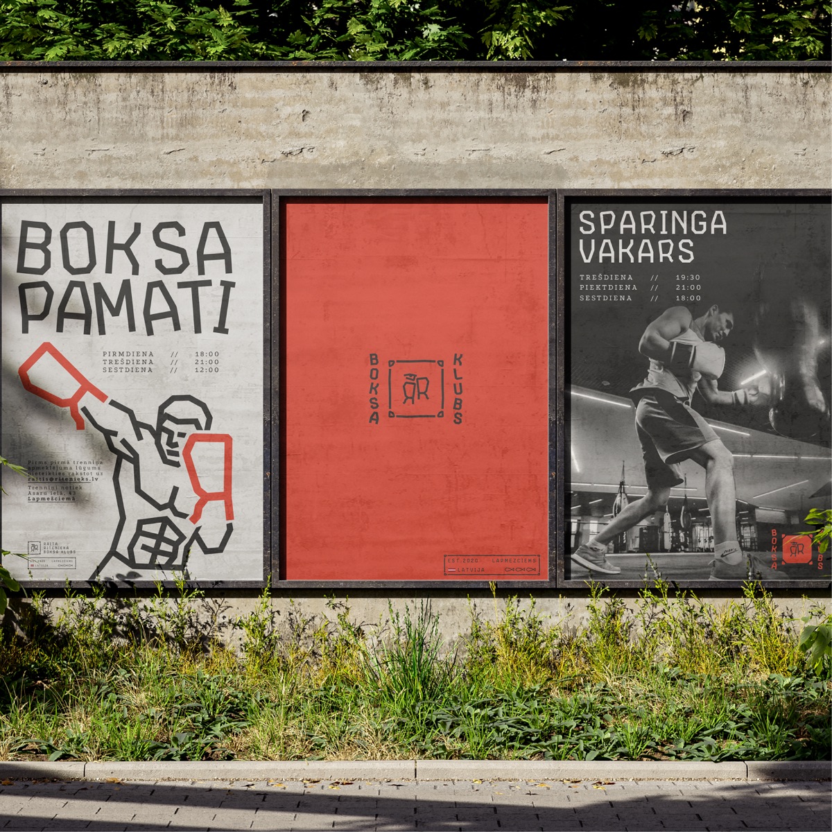
Worn, Carried, Used
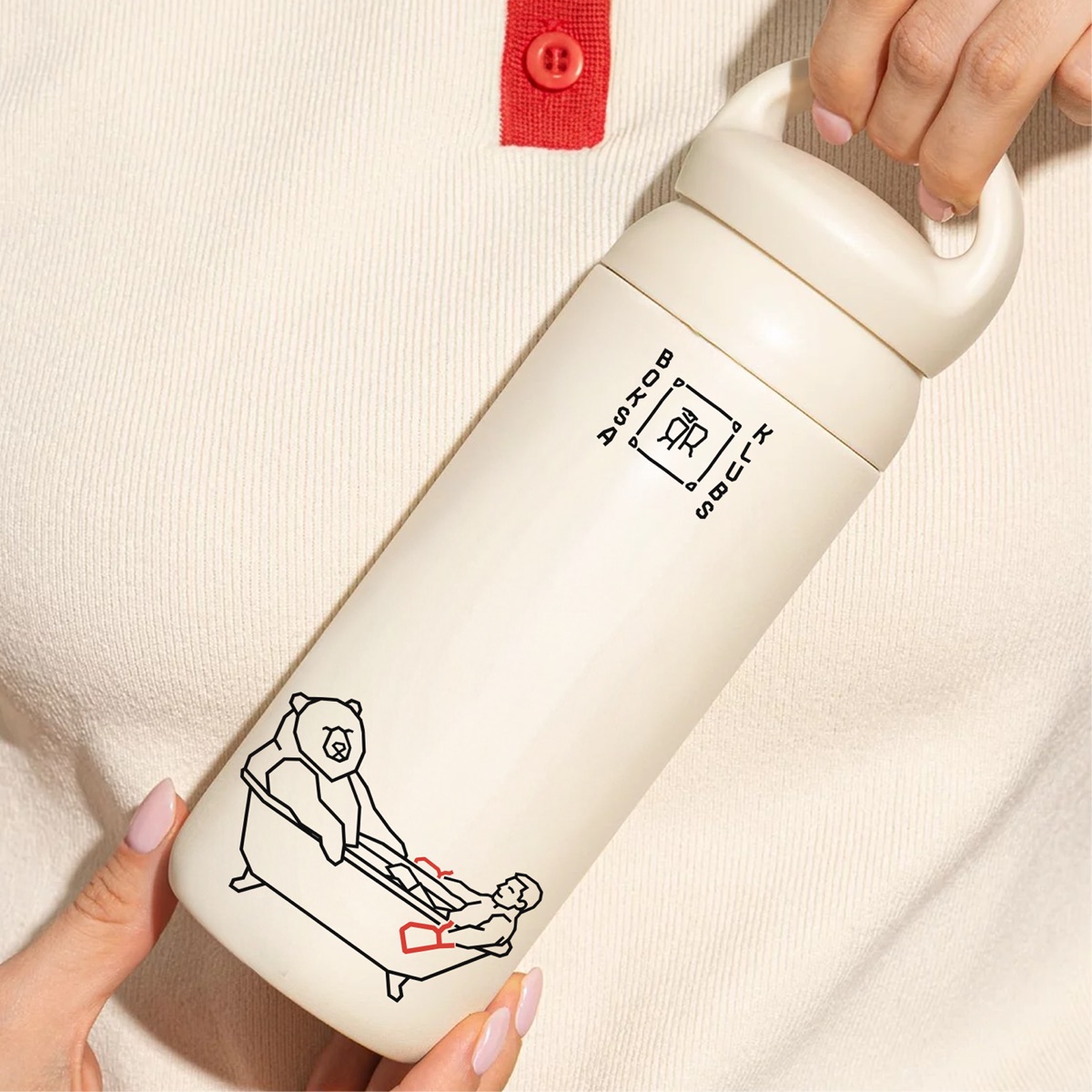
The identity extends into objects. Every piece of merch is treated as a carrier of the system — not branded filler, but designed artefacts that hold their own.
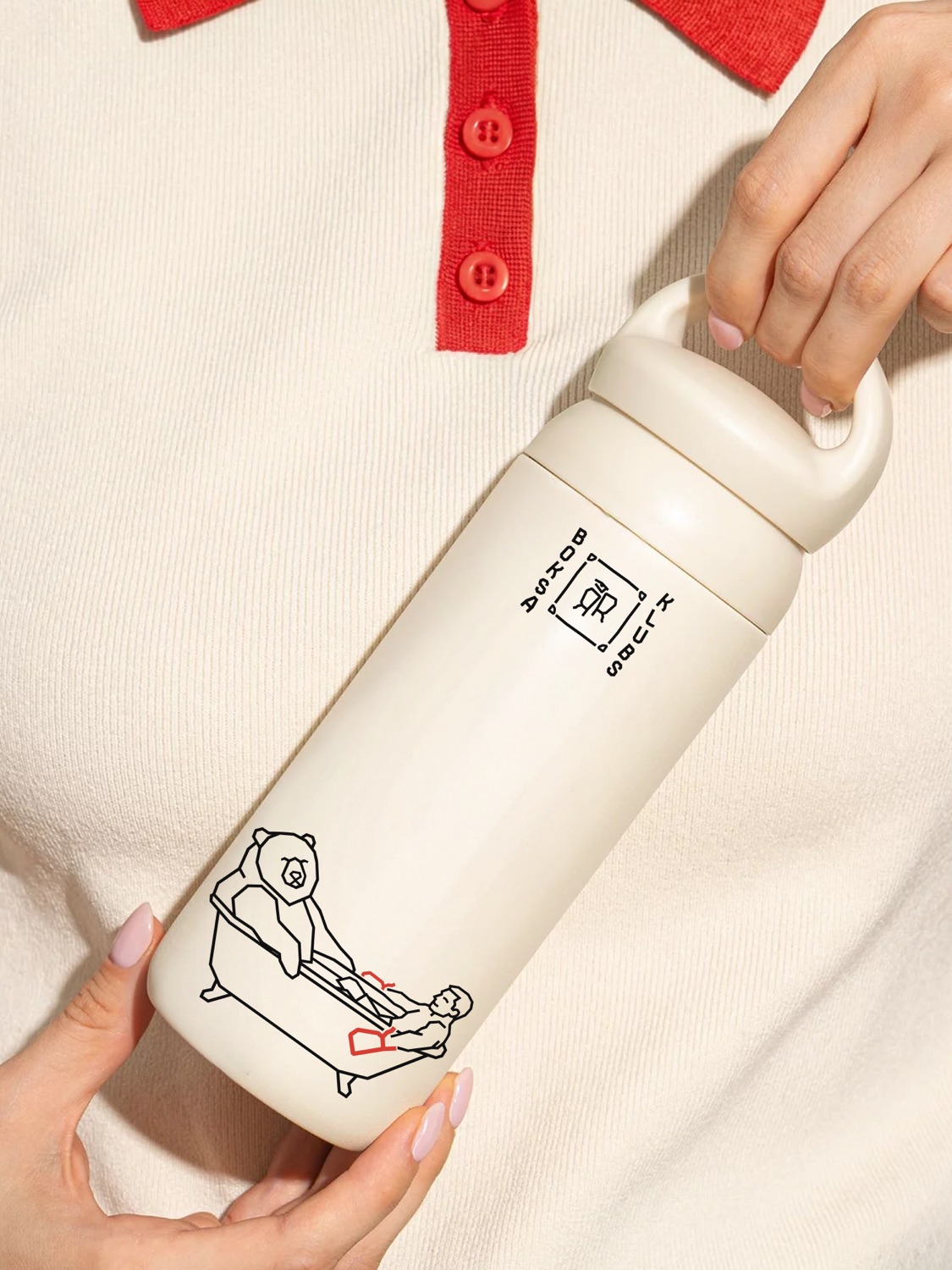 Fig.16 / Water bottle
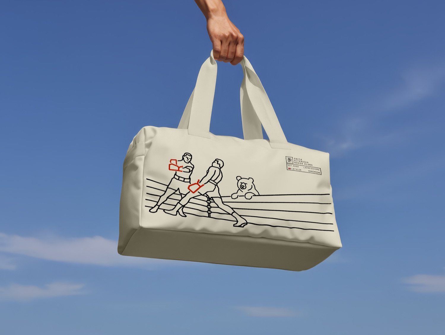 Fig.17 / Duffel bag
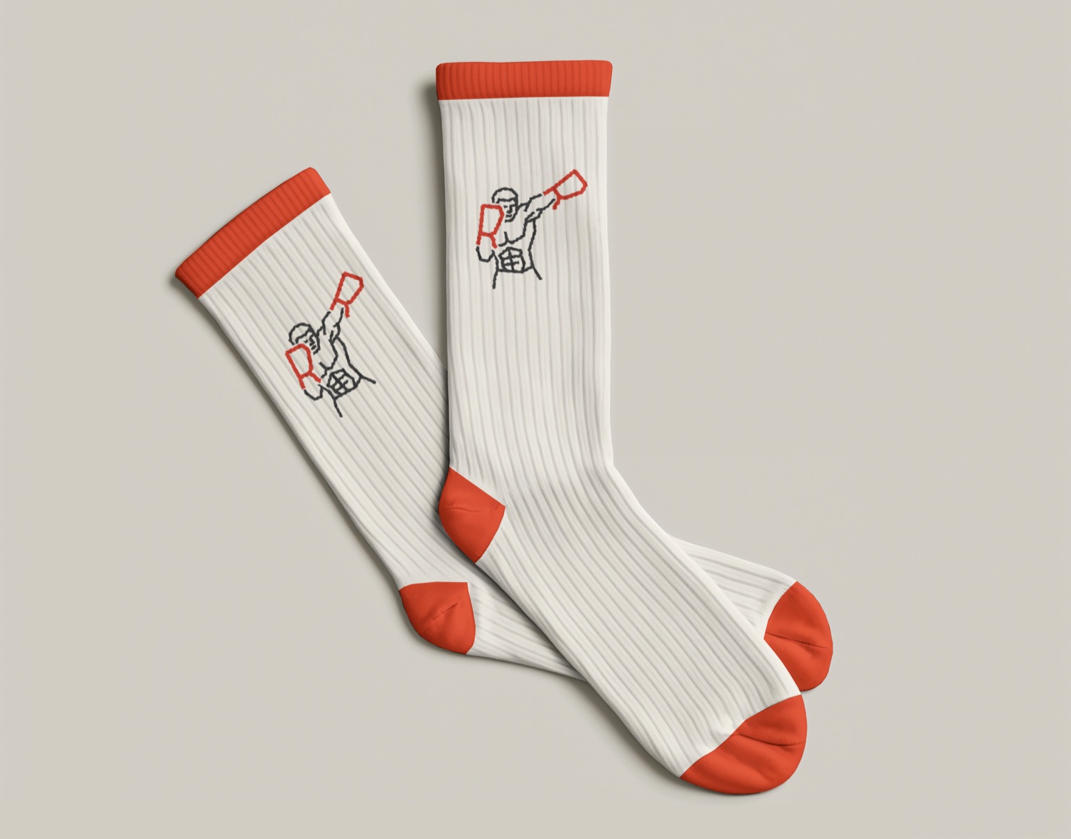 Fig.18 / Socks
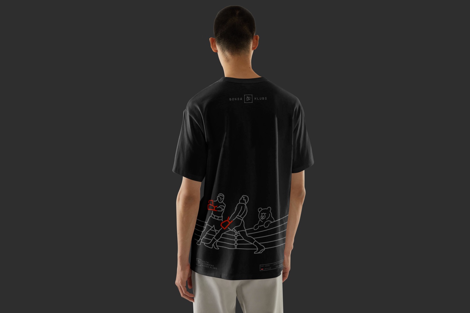
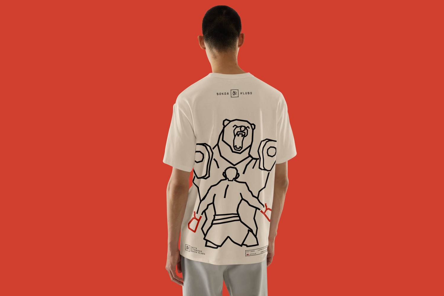 Fig.19 / Apparel
A Line, Two Tones
A run of tees built on the illustration system — each design offered in a light and a dark colourway. Same mockup, swap the story.

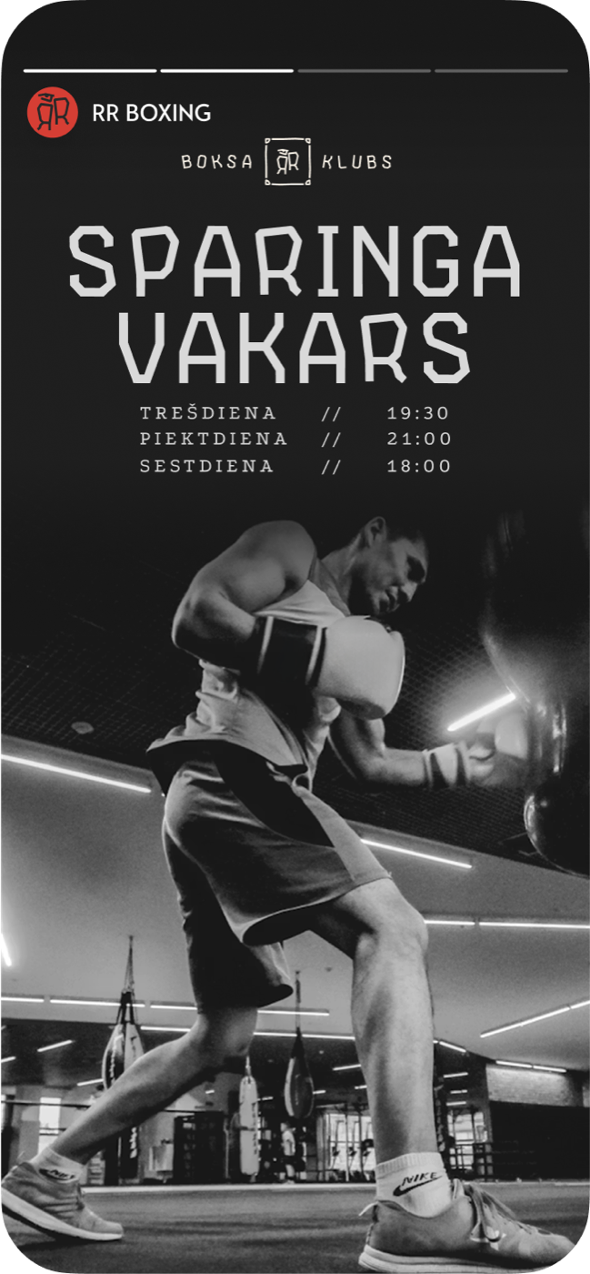
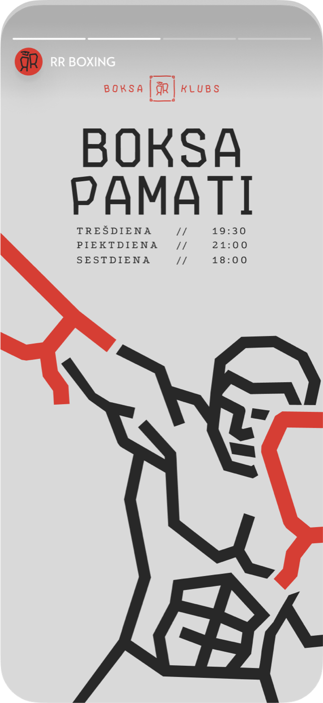
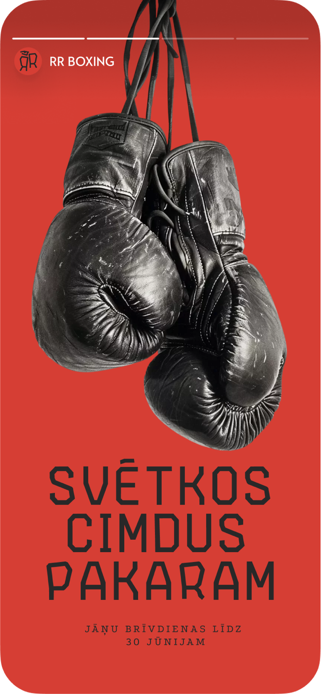
Stories That Move
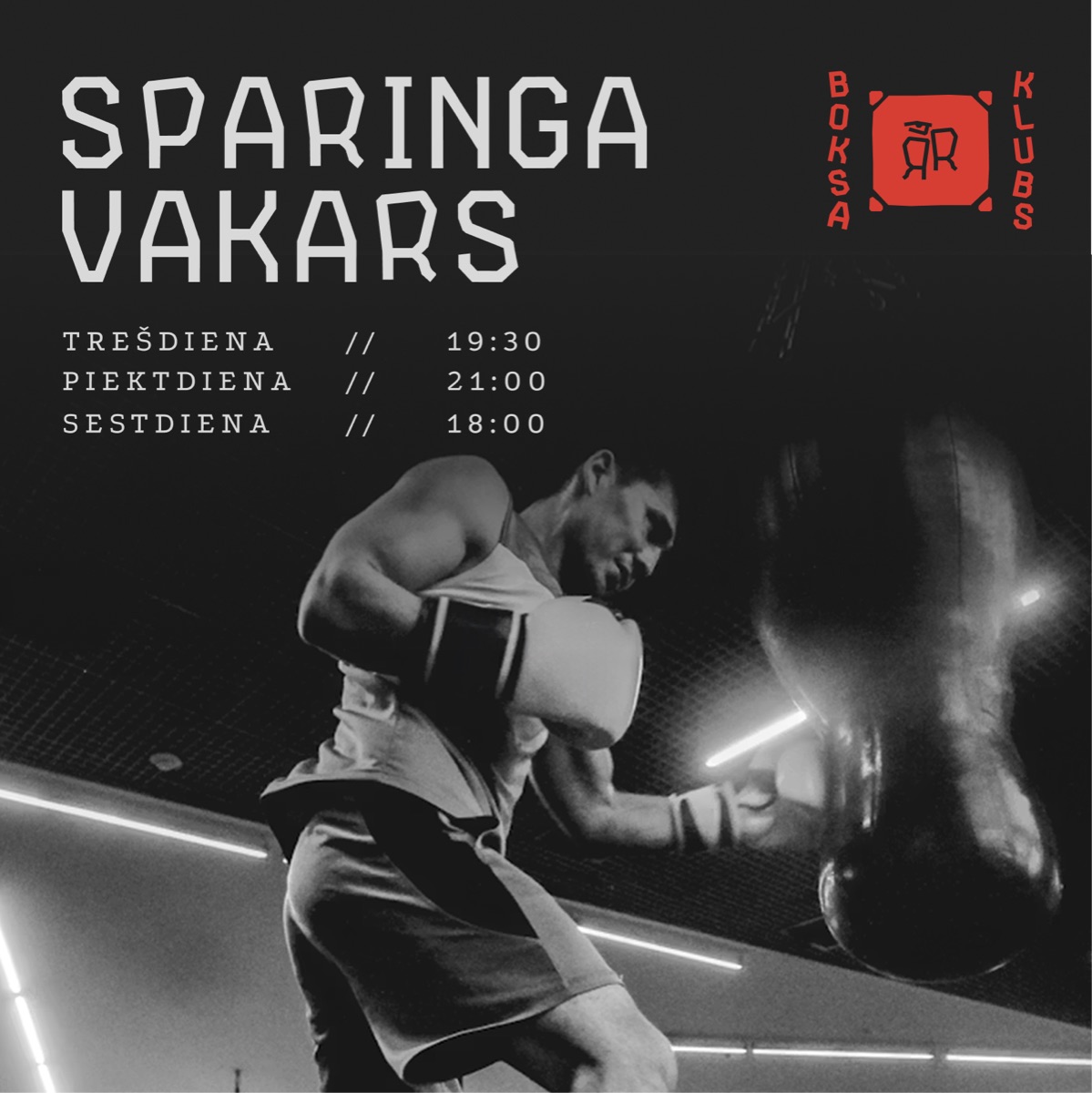
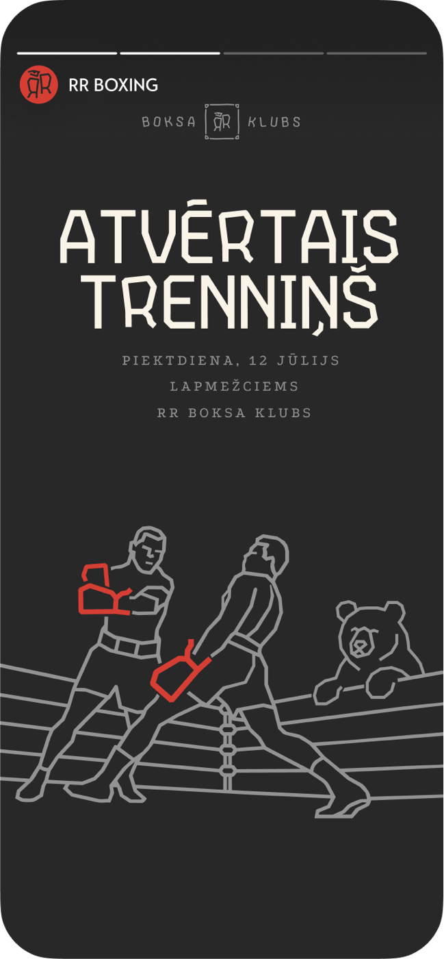
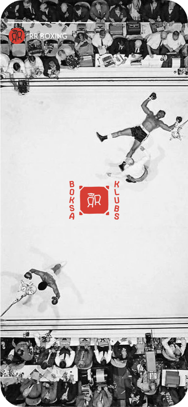
A set of Instagram Story templates built on the same type, illustration and color logic — ready to drop new content into, so the feed stays consistent week to week.

One Good Card
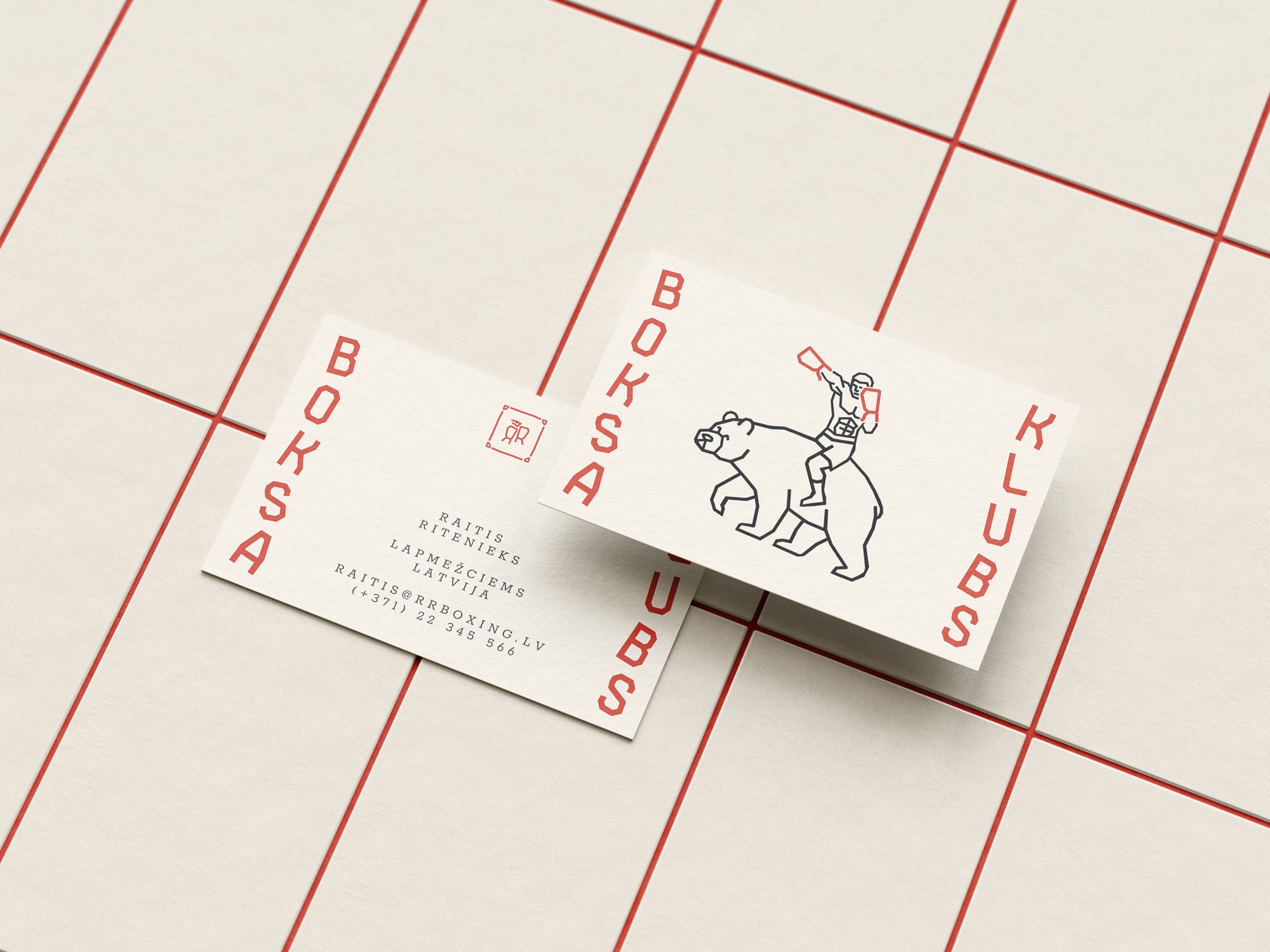
A boxing club doesn't need much paper — so the stationery comes down to a single, considered business card. Mark, typeface and illustration, in the hand.
Bargais Eposs
An illustrated book of Raitis Ritenieks' poetry — currently in the making. The mark, the Bargais Display typeface and the illustration language carry off the apparel and onto the page, turning the brand into a small epic of its own.
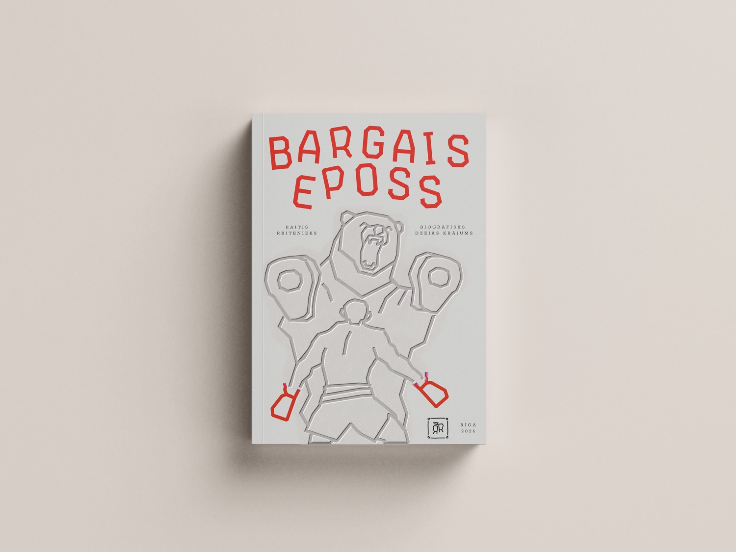 Fig.20 / Cover
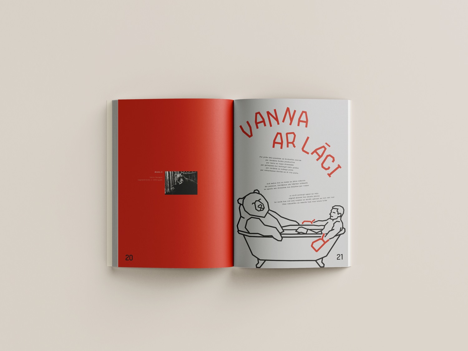 Fig.21 / Inside spread — “Vanna ar lāci”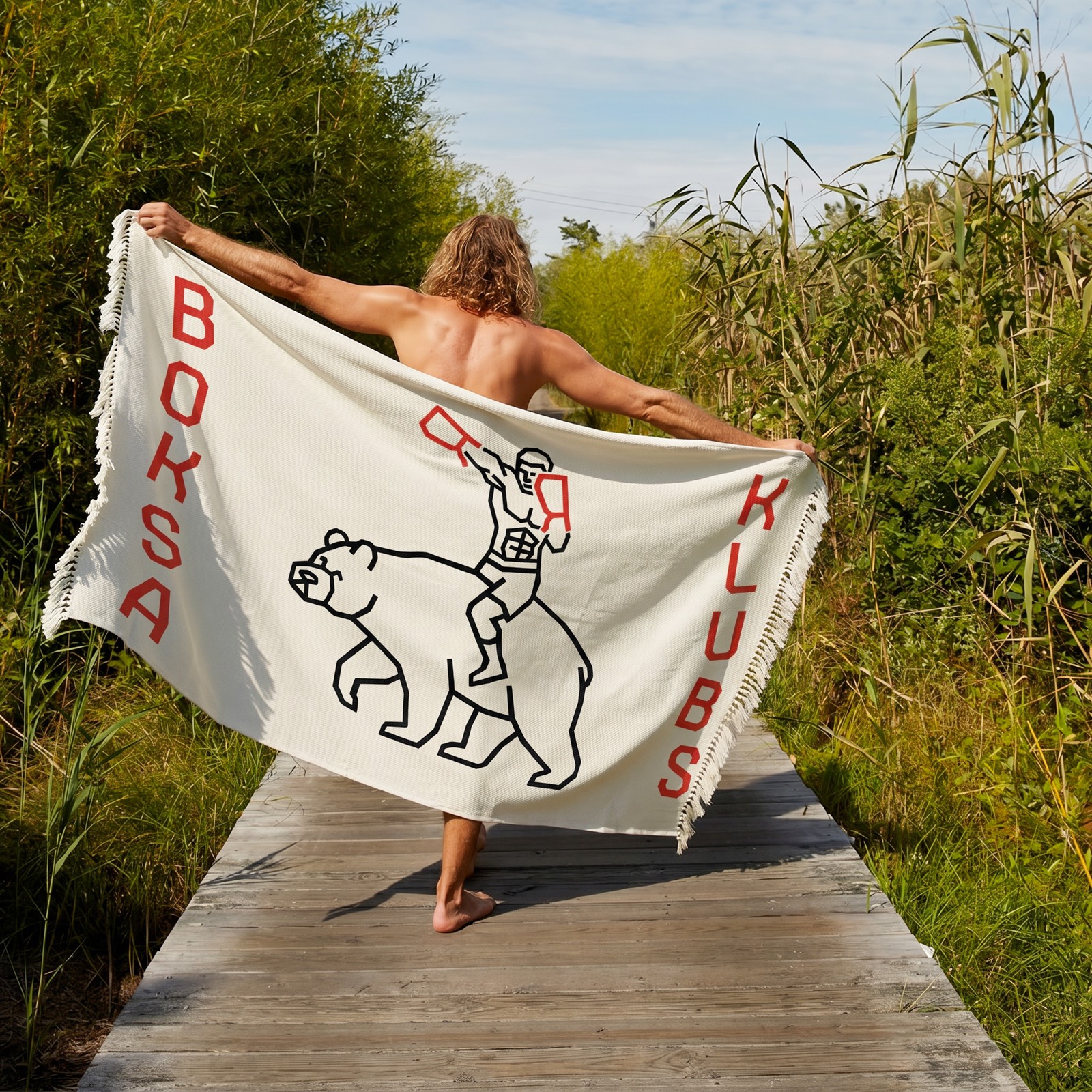
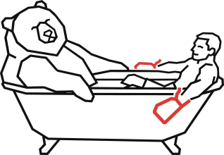
Get in looser, the water is fine